
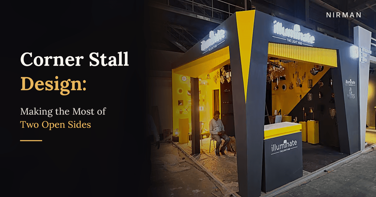
Corner Exhibition Stall Design: How to Make the Most of Two Open Sides
A corner stall is one of the most valuable spots on an exhibition floor. Two open sides mean two streams of visitors, more visibility and more ways in. But many brands design it like an ordinary inline booth and waste half its potential. Here is how to get it right.
Ask any experienced exhibitor which stall they would choose if price were not a factor, and most will say the corner. It sits where two aisles meet, it is seen by visitors coming from two directions, and it can be entered from more than one side.
That is why corner stalls are usually booked first and often cost more. Yet many brands treat them like a regular inline stall with an extra opening. They put a back wall on one side, a counter across the front, and leave the second open side doing almost nothing.
A corner stall is not just a stall with one more open side. It is a different kind of space, and it needs a different design approach. This guide covers how to make the most of it.
| Understand How Visitors Approach a Corner
In an inline stall, visitors see you mostly from the front as they walk past. At a corner, people approach from two aisles, and many will see your stall diagonally, from a distance, before they see either side clearly.
This changes where your most important elements should go. The corner point itself, where the two open sides meet, is the most visible spot on your stall. That is where your brand should be strongest.
In a corner stall, the corner is your shop window. Treat it like one.
| Make the Corner Point Work Hardest
The corner where both aisles meet is usually the first thing visitors see. Use it for something bold and recognisable:
- A tall structural element such as a pillar, a dramatic angled frame or a branded column
- Your logo at height, lit and visible from both aisles
- A striking colour block that makes your brand instantly identifiable
- A hero product or display placed where both streams of visitors will notice it
Avoid placing a closed wall or storage room at the corner. It blocks the view from both sides at once.
| Give Both Sides a Job
The second open side should not be an afterthought. Each side of a corner stall faces a different aisle and a different flow of people, so each needs a clear purpose.
One common approach is to make one side the main entrance with your key message and product display, while the other side carries a secondary display, a demonstration area or a branded wall visible from the second aisle. Both sides should look finished and inviting, because each will be someone's first view of your stall.
| Keep It Open and Easy to Enter
The biggest advantage of a corner stall is access from two directions. Do not block it.
- Keep counters to the side, not straight across either opening
- Avoid tall walls along open edges, which turn a corner stall back into an inline one
- Leave a clear walking path so visitors can step in from one aisle and out through the other
- Use low displays near the edges and taller elements towards the back walls
A stall that people can walk through naturally tends to collect far more casual visitors than one that feels like a closed room.
| Use Bold Colour and Structure
Because a corner stall is seen from a distance and from angles, simple, strong shapes and confident colours work especially well. A bold frame, an angled canopy or two contrasting colours can make your stall recognisable from the far end of an aisle.
Keep the palette tight. Two or three brand colours used boldly will look stronger and more premium than many colours competing with each other. Repeat them on both open sides so the stall reads as one confident space from every angle.
| Light It From Both Directions
Lighting at a corner stall needs to work for visitors coming from two aisles. A spotlight that looks perfect from one side can create glare or shadows from the other.
Light your corner branding so it is visible from both directions, use backlit logos or signage on the fascia, and make sure both open sides are evenly bright. For product-heavy stalls, illuminated displays or lit shelves draw people in from both aisles at once.
| Common Corner Stall Mistakes
- Treating it like an inline stall. A back wall on one side wastes the second opening.
- Blocking the corner. A storeroom or closed wall at the corner point hides you from both aisles.
- Counters across the openings. They create barriers on the very sides that should invite people in.
- One side left plain. Visitors from the second aisle see an unfinished or empty view.
- Too many colours and messages. A corner is seen from far away, so clarity matters even more.
| Working With Nirman
We design and build corner, island and inline stalls of every size across Kolkata, West Bengal and India. For corner stalls, we plan the layout around how visitors will actually approach from both aisles, so every side of the space works for you. With 28+ years of experience and 878+ projects delivered, we handle the full process from 3D design and fabrication in our Kolkata workshop to installation on site.
If you have booked a corner stall for your next exhibition, get in touch with us and we will help you make the most of it.
| Frequently Asked Questions
Is a corner stall worth the extra cost?
In most cases, yes. A corner stall is visible from two aisles, can be entered from two sides and usually attracts more footfall than an inline stall of the same size, provided the design takes advantage of both open sides.
What is the difference between a corner stall and an island stall?
A corner stall is open on two sides, where two aisles meet. An island stall is open on all four sides and stands on its own. Island stalls need a fully 360-degree design, while corner stalls still have two closed sides to work with.
Where should the logo go on a corner stall?
At height, near the corner point where the two open sides meet, and lit so it can be seen from both aisles. A second logo on the fascia of each open side also helps.
Can a small corner stall still look premium?
Yes. Even a 3x3 corner stall can look premium with a bold structure at the corner, a tight colour palette, good lighting and a layout that keeps both sides open.
Where should storage go in a corner stall?
Against one of the closed back walls, away from the corner point. Built-in storage under counters also helps keep the stall clean without blocking either opening.
| Conclusion
A corner stall gives you something most exhibitors do not get: two aisles of visitors and two ways in. Use the corner point for your strongest branding, give both sides a clear job, keep the openings free, use bold colour and structure, and light the stall for both directions.
Design it this way and your corner will not just be well located. It will be the stall people remember walking into.
Booked a corner stall for your next exhibition? Contact Nirman for a free consultation and 3D concept. You may also like our guide on small exhibition stall design for more ideas on making every square metre count.
Planning an exhibition? Let's talk.
Get a free consultation and 3D concept for your next exhibition stall.